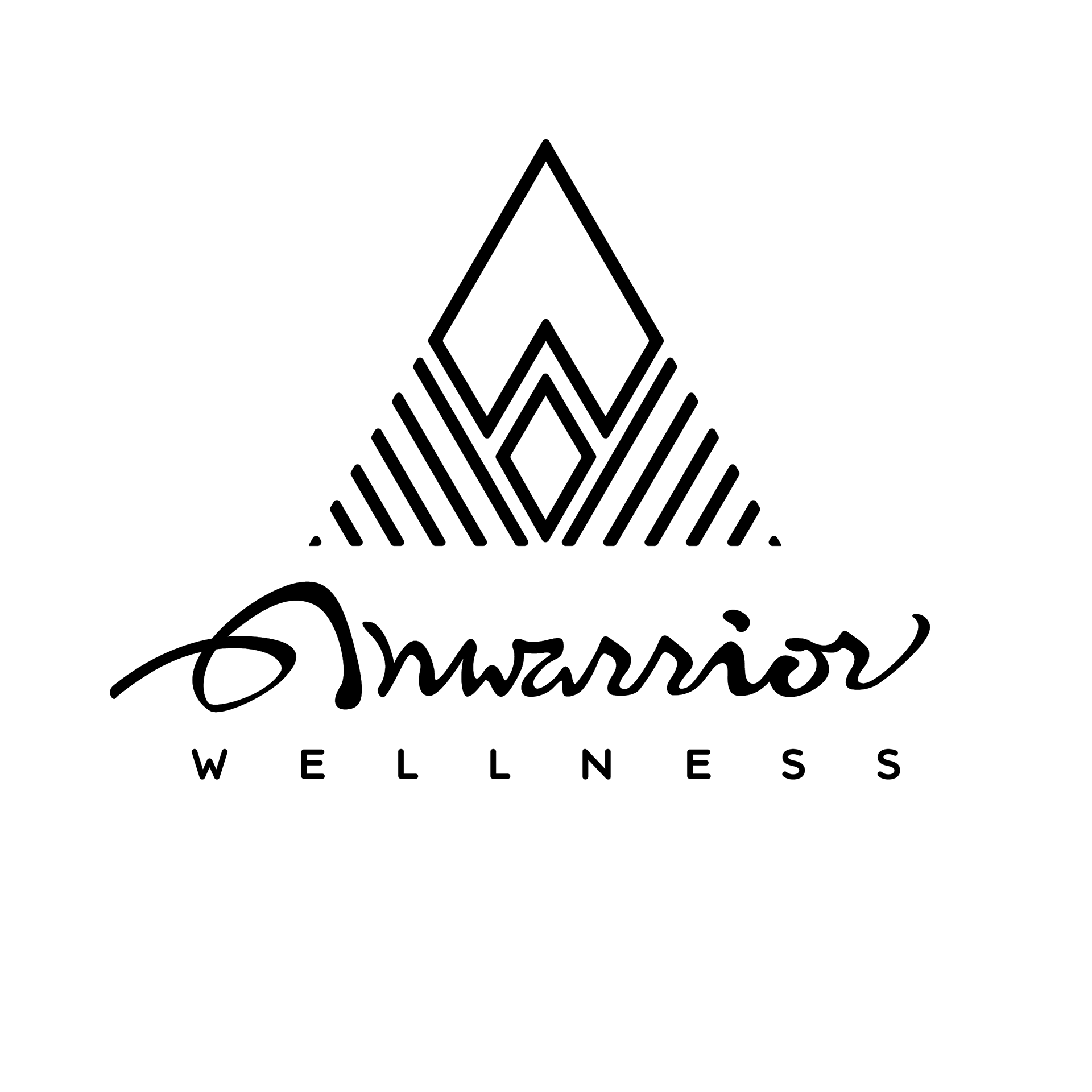
CLIENT NEED
The client, a Harlem-based fitness trainer, has been creating a fitness+wellness company that encompasses physical and mental wellbeing. She needed a logo and branding that could embody the collective tribe of wellness warriors she wants to cultivate.
SOLUTION
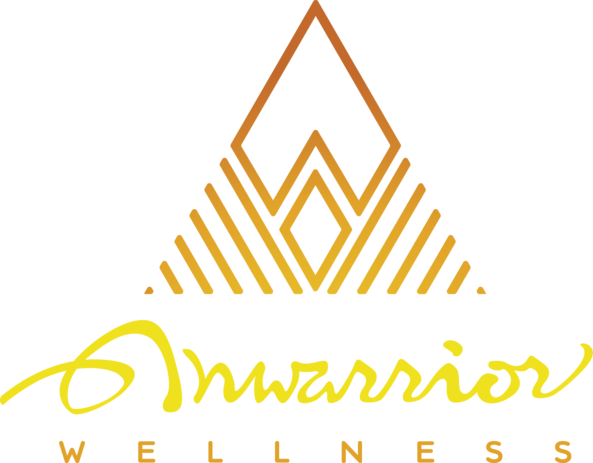
Finding inspiration in African tapestry prints gave the design an appropriate connection to the client's cultural roots. This direction yielded the Tribal Triangle design which is made up of three parts: (1) AW tip, the initials of the company which lead the journey, (2) side stripes, angled in two directions represent the many places people come from as well as how long they've been on a personal journey, and (3) the central diamond, representing the central goal of the tribe as well as the individual.
MY ROLE
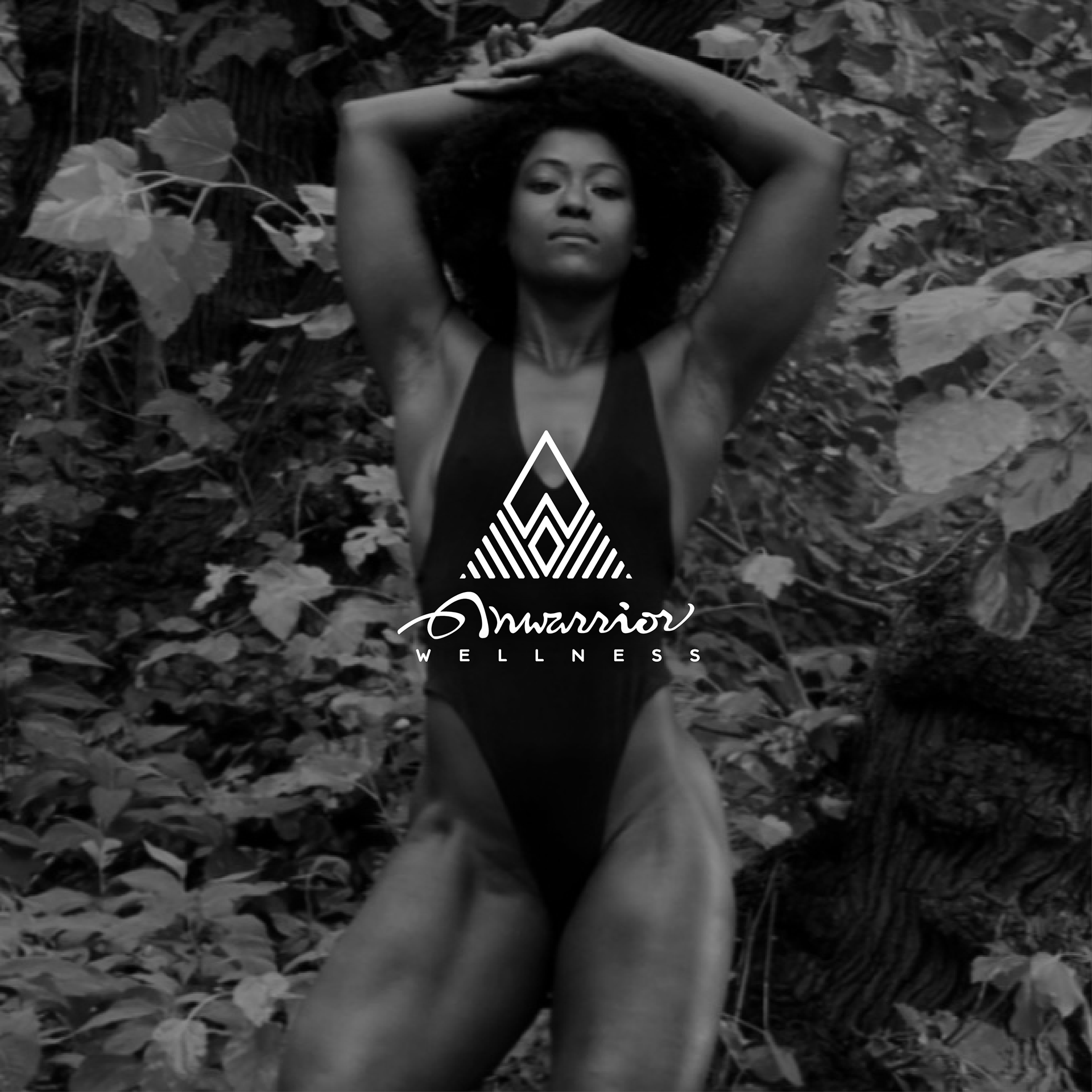
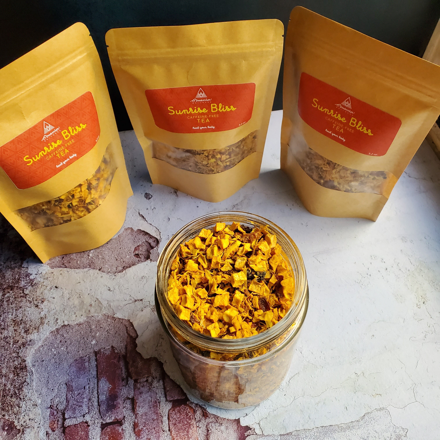
I created multiple logo variations/options for my client. Once we selected a design I began to create branding for the line of herbal tea(s) and other products to be offered.