CLIENT NEED
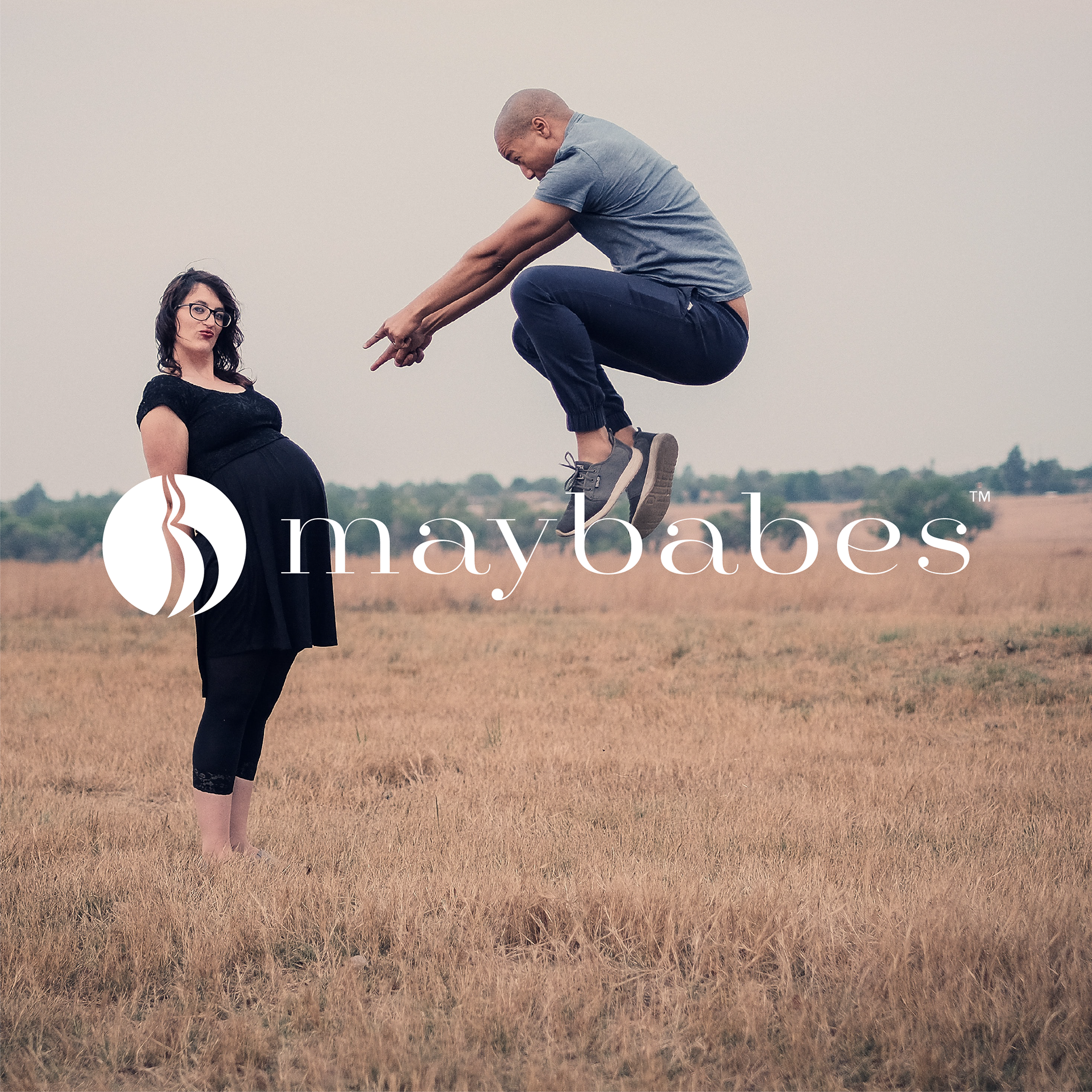
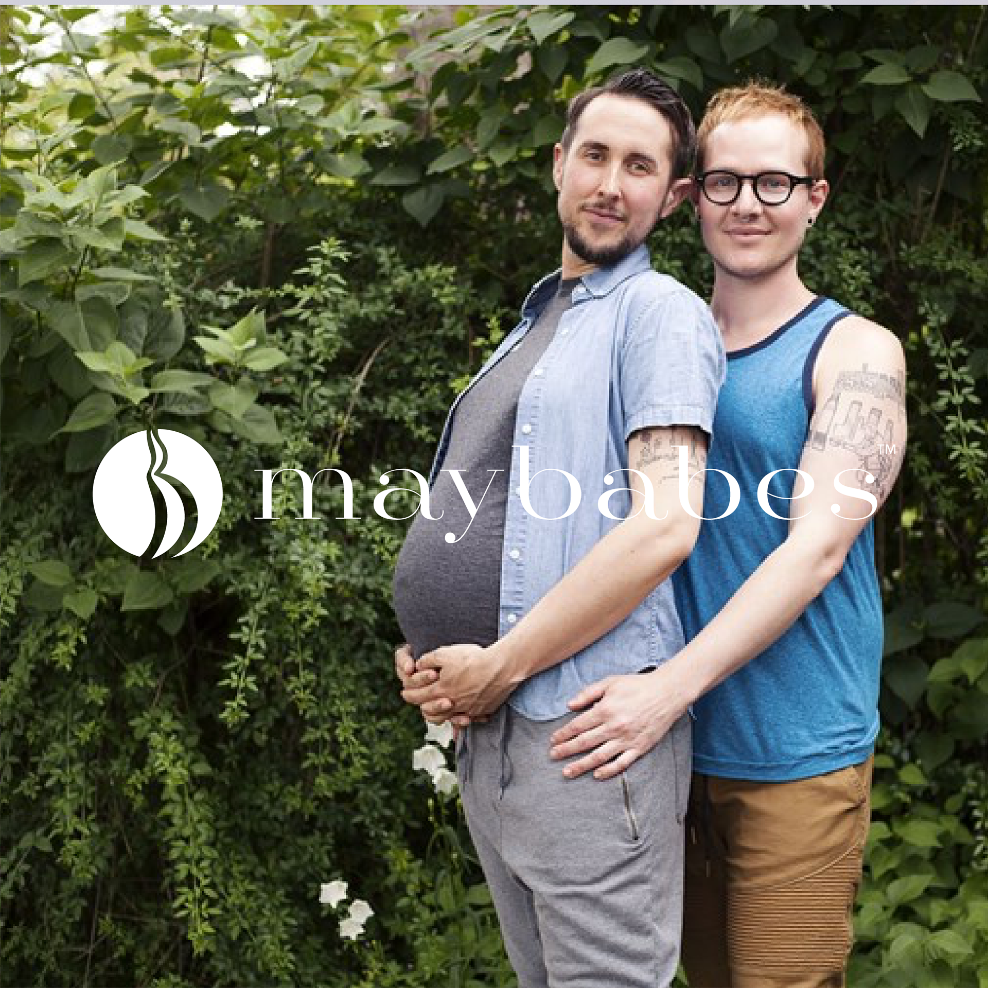
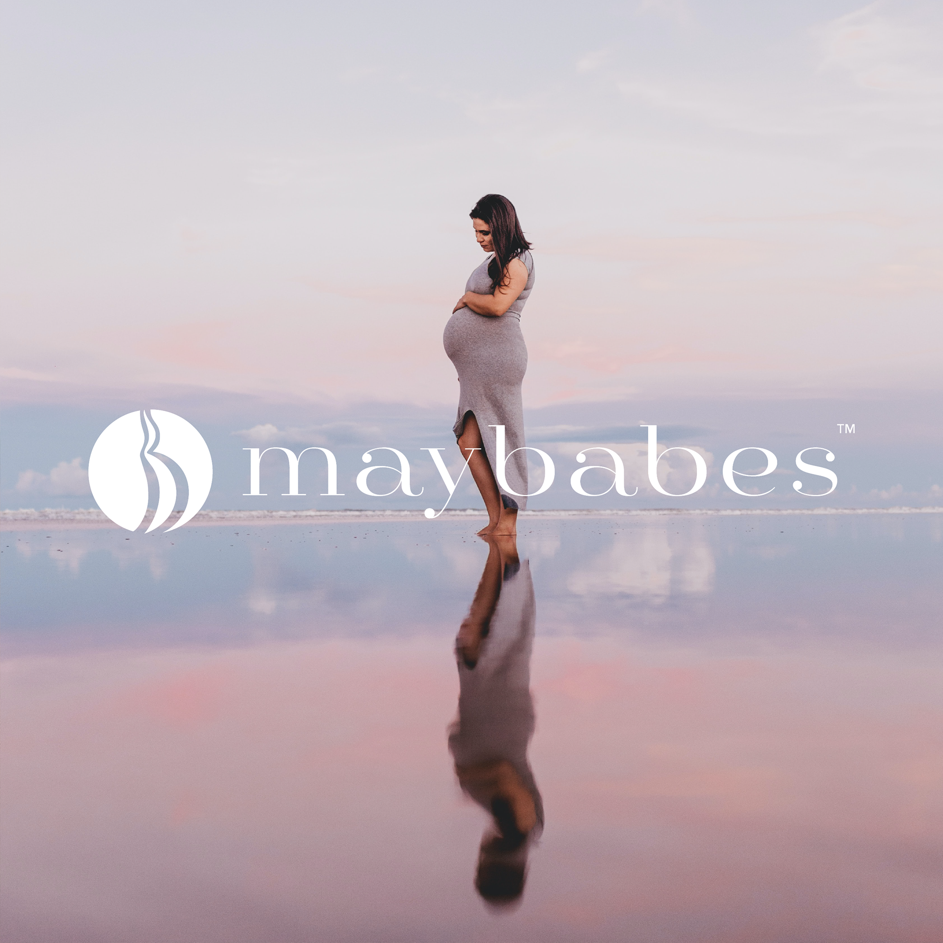
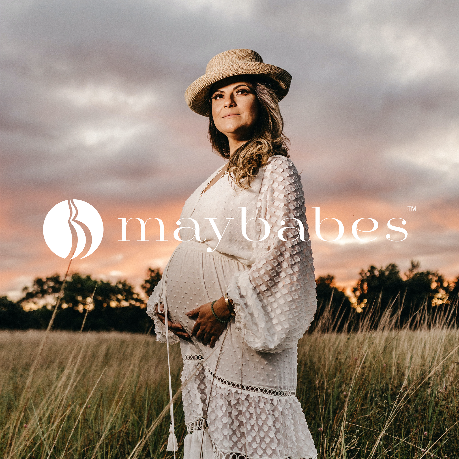
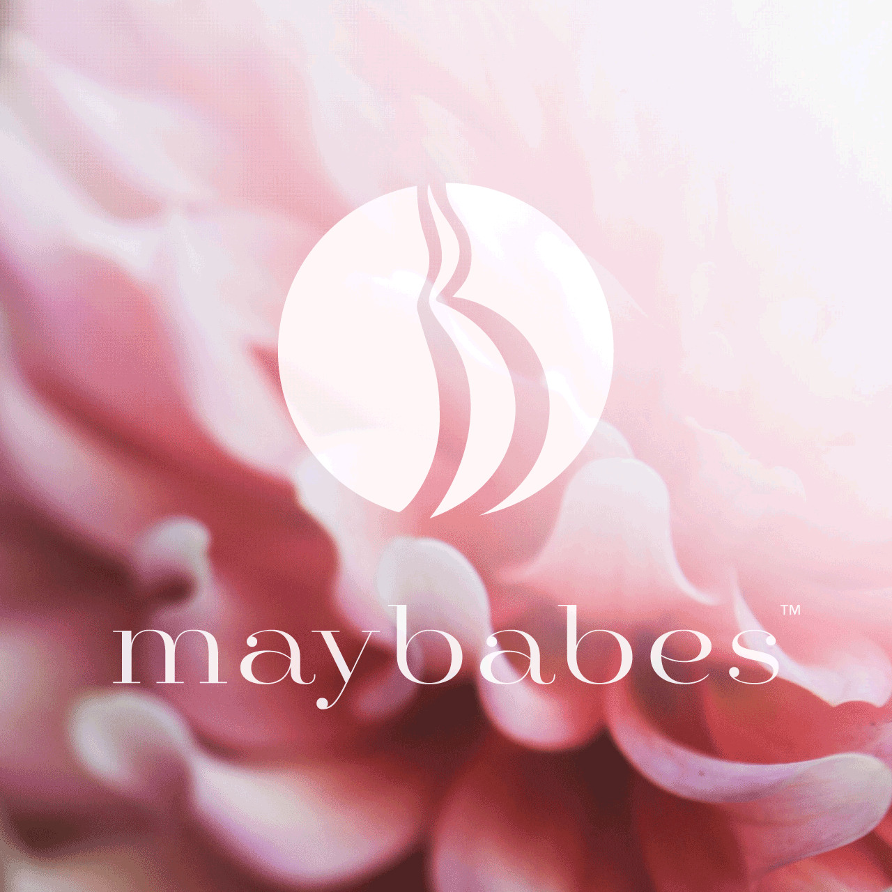
May Babes Maternity is a new maternity clothing brand that is setting new standards for what motherhood looks like. They want to represent a more diverse/inclusive maternal audience and asked for a logo mark that would communicate as much.
SOLUTION
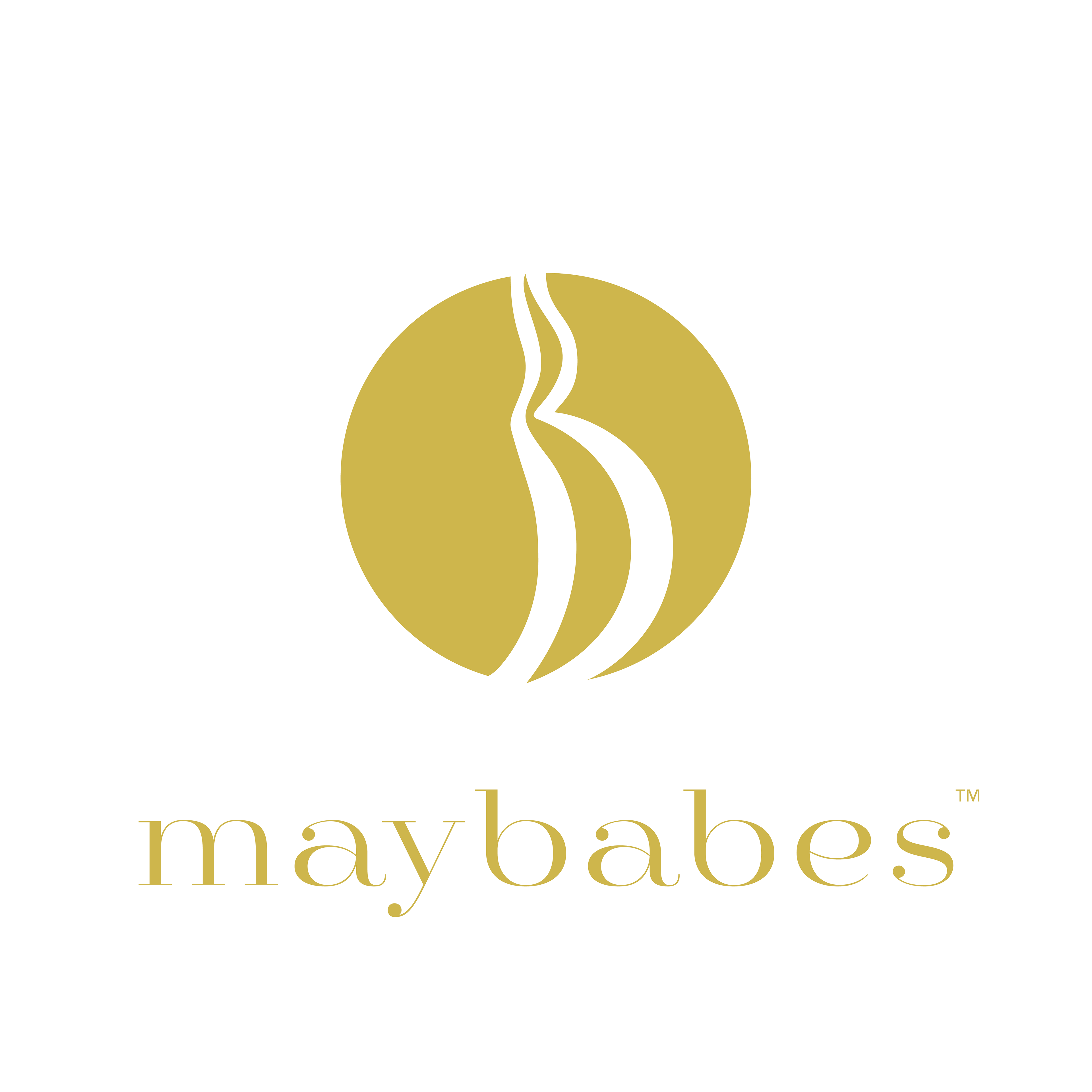
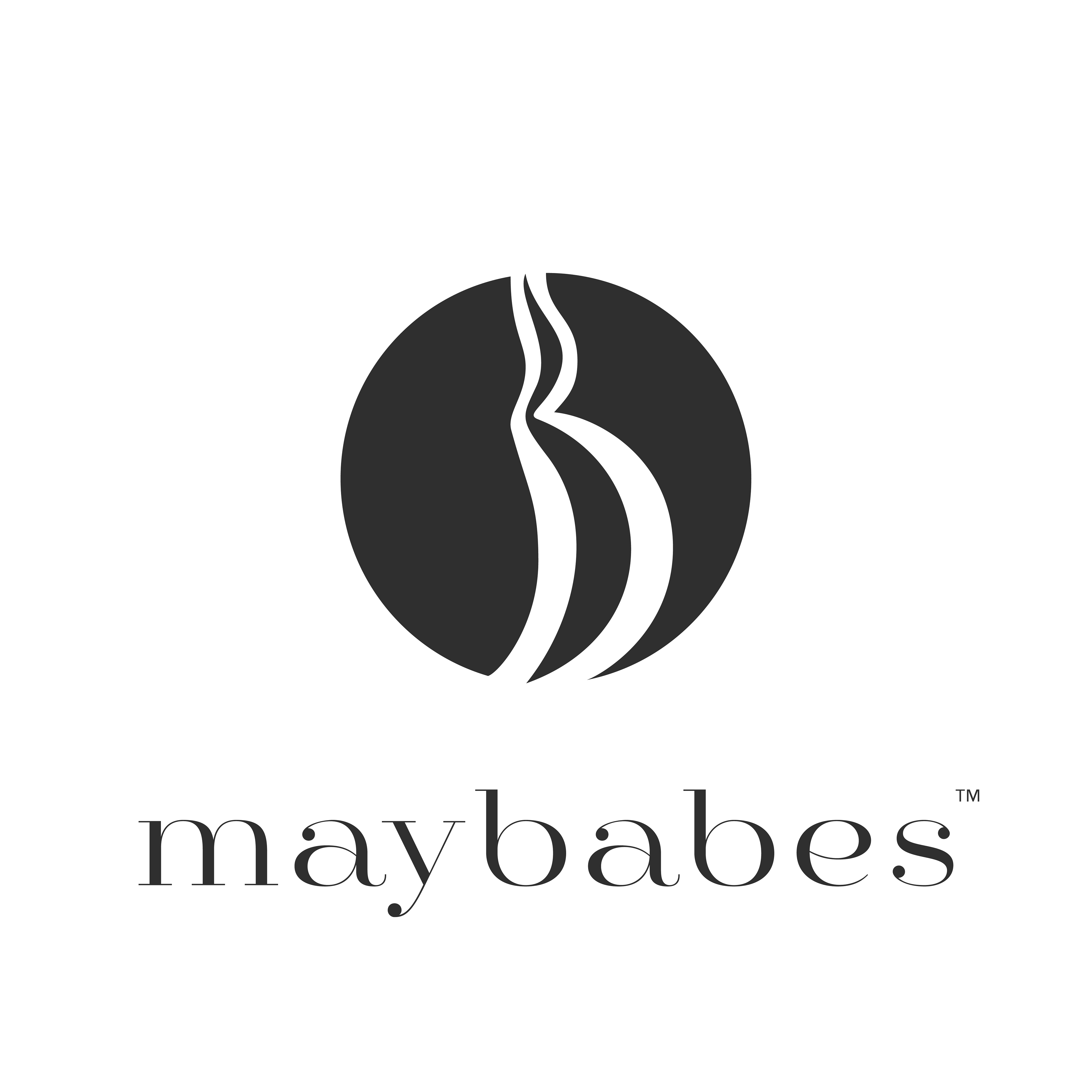
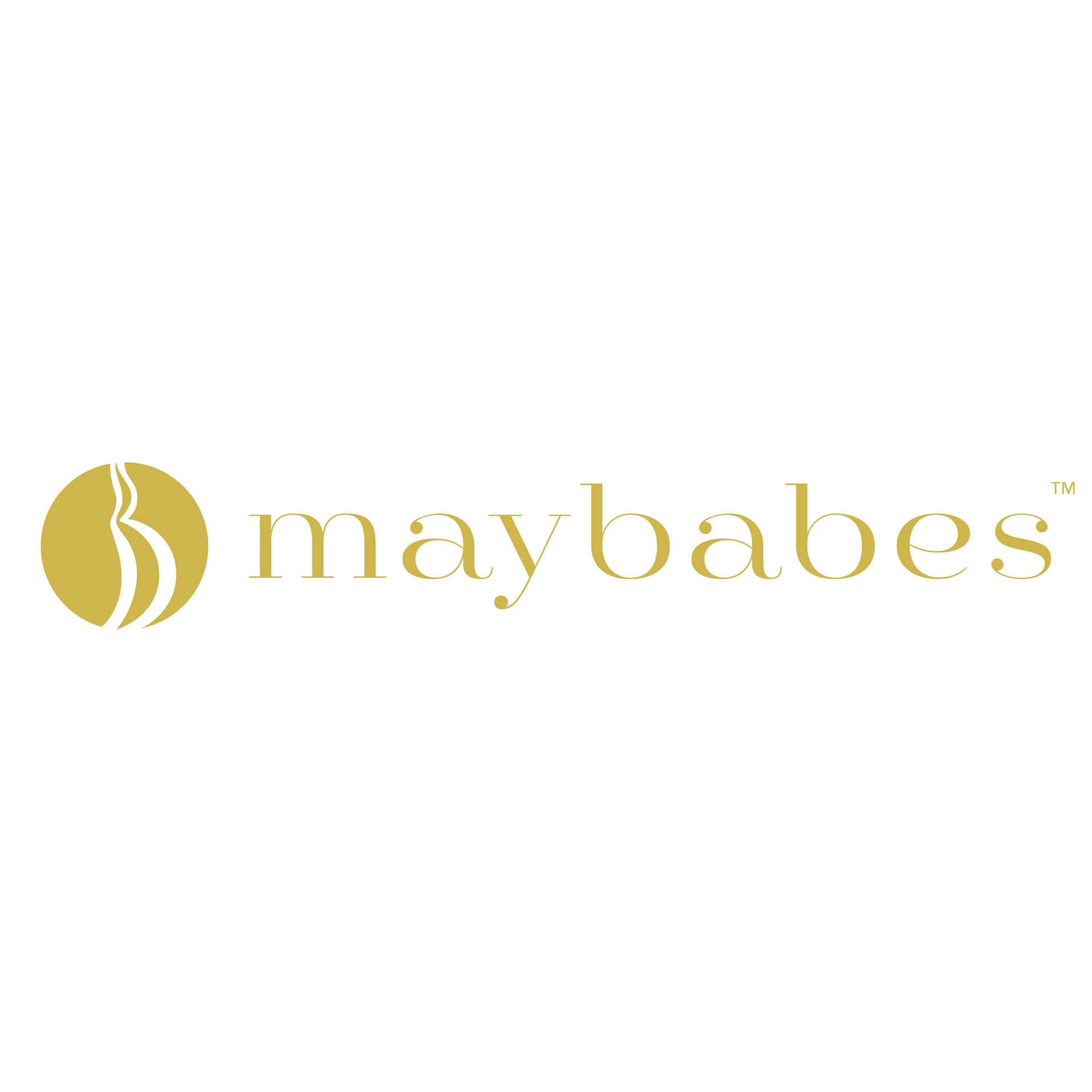
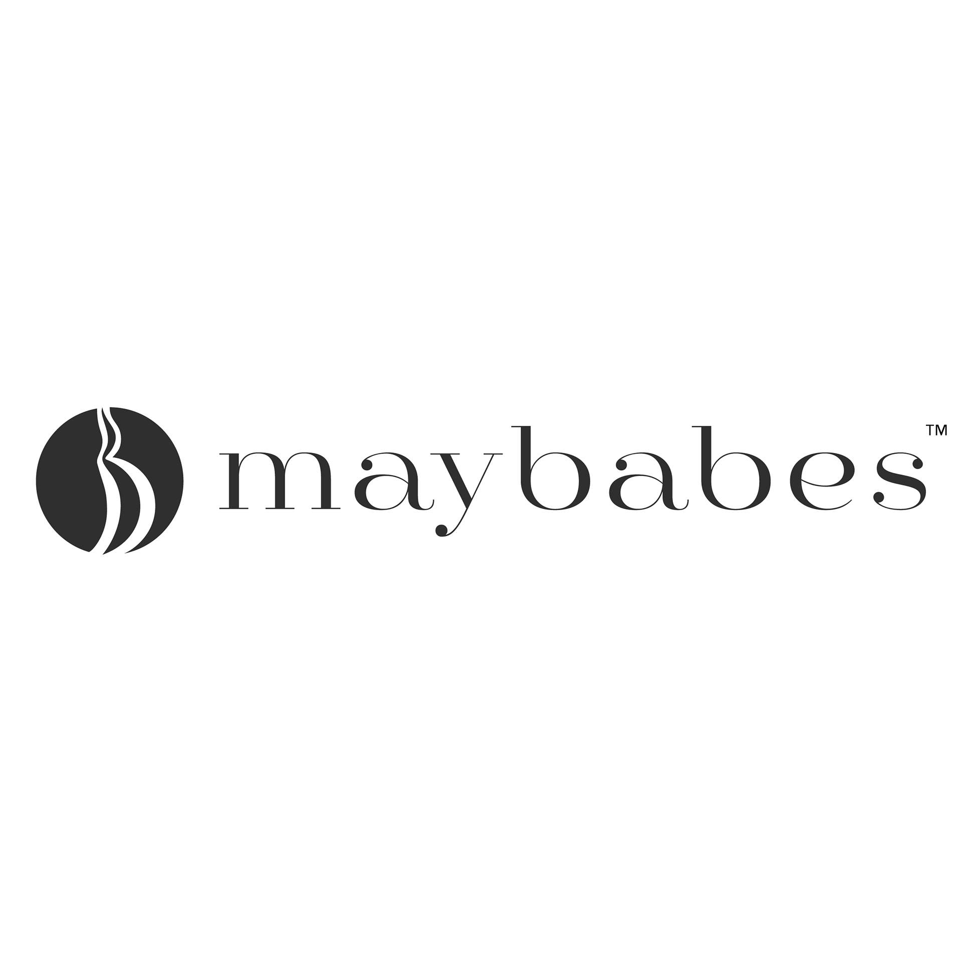
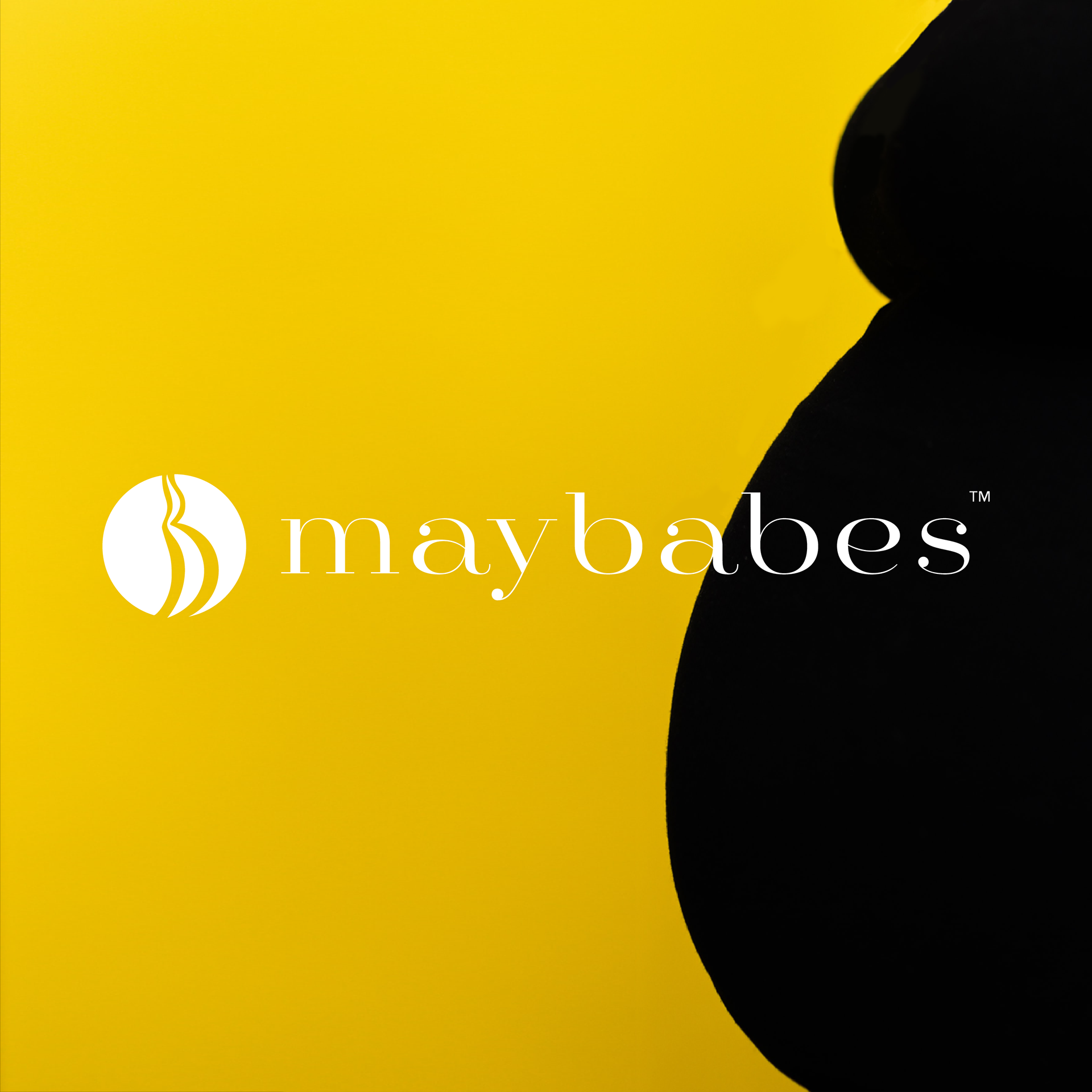
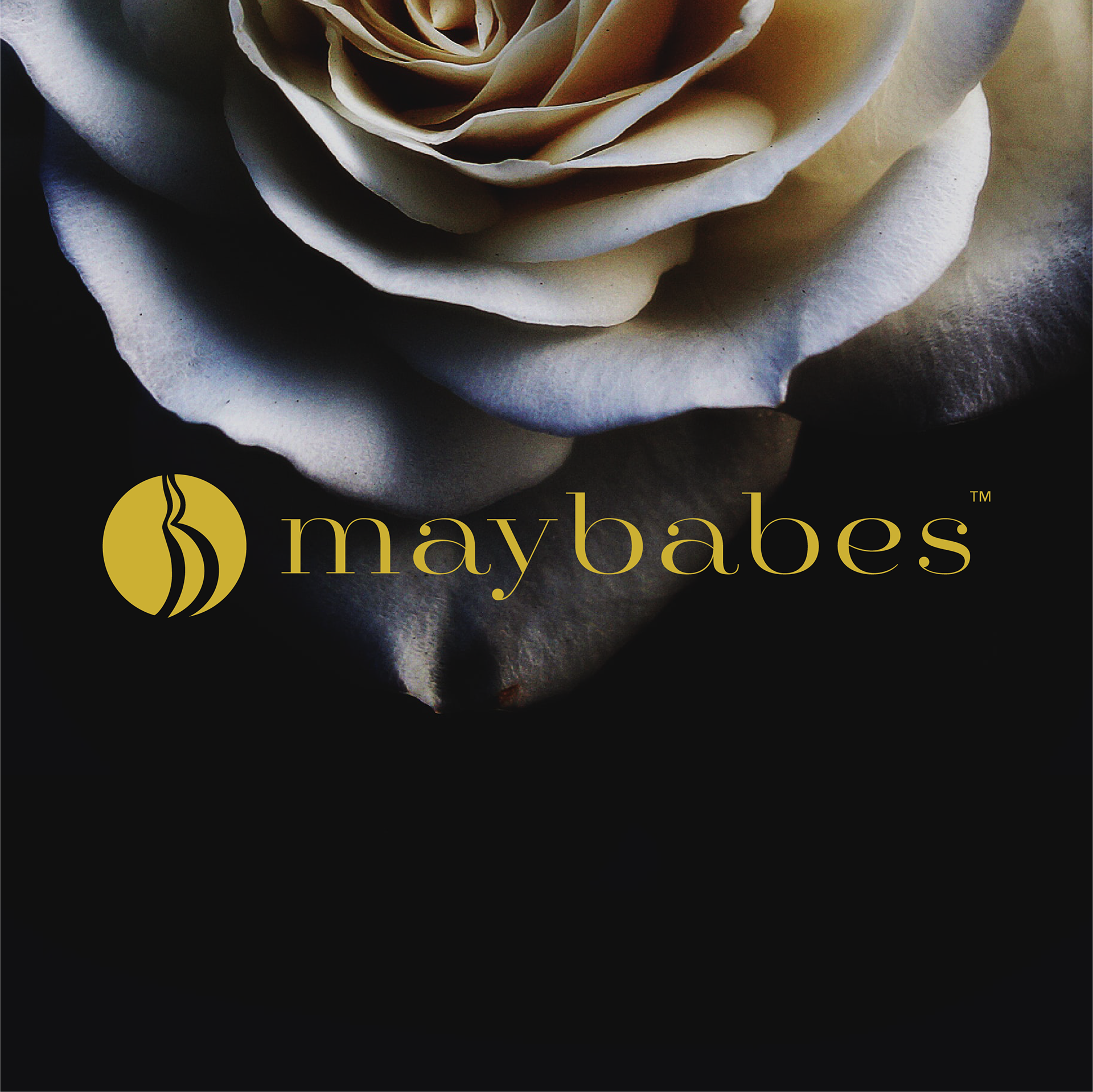
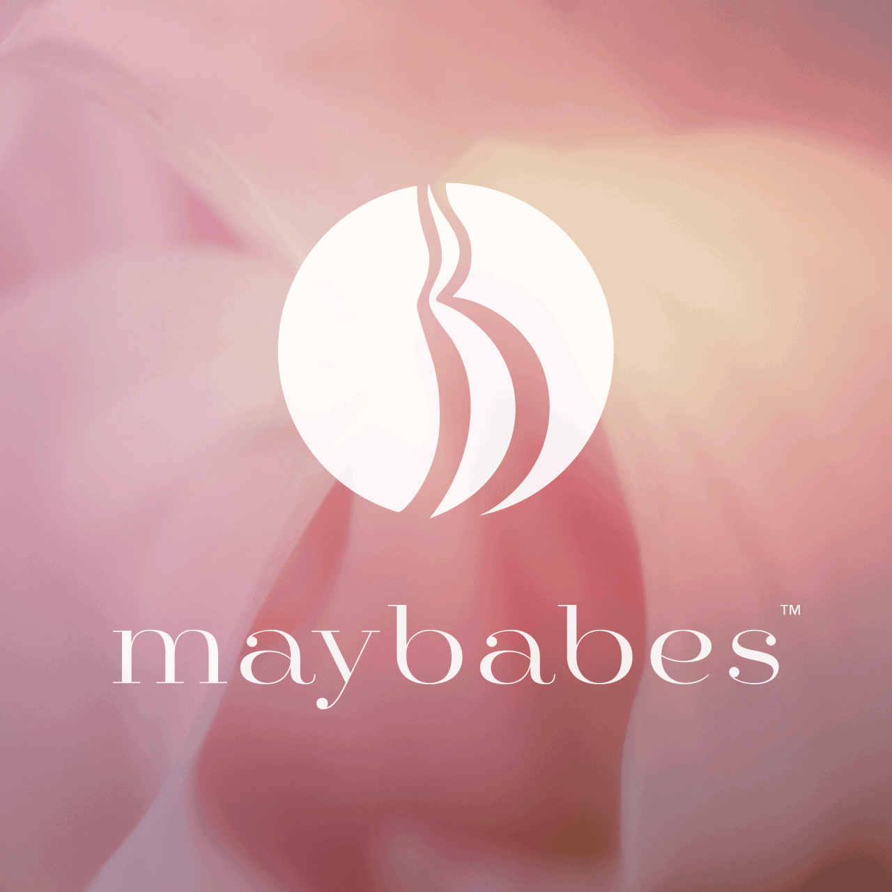
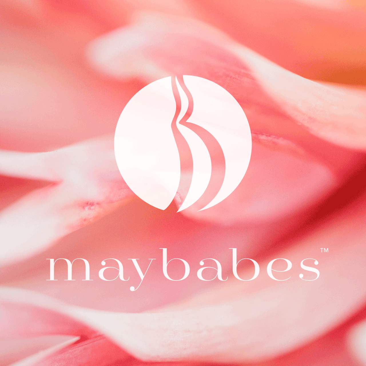
The Baby Bump logo was created to represent the maternal journey and honor everyone's unique process. The design was inspired by the trimester cycle, showing the growth and development of a pregnancy. These silhouettes are also representative of the different bodies and shapes of womxn.
MY ROLE
Working with the Creative Director, Suzanne Darmory, to establish the brief, I developed several design options. The result was the Baby Bump design paired with the font choice (Mittwoch).